Choose colours for your text and background which have a contrast ratio of at least 4.5:1.
How do I comply?
- Check contrast ratios using an online contrast checker.
- There are many contrast checkers available, but our preferred tool is the WebAIM colour contrast checker.
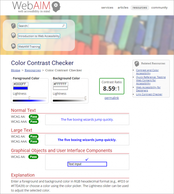
- The WebAIM colour contrast checker has the following functionality:
- Pass or fail indicators for WCAG AA and AAA levels.
- Pass or fail indicators for normal and large text size.
- Pass or fail indicator for Graphical objects and User Interface Components useful for 1.4.11. Non-text Contrast (Level AA).
- Lightness sliders which allow you to darken or lighten the colours you have input, until they pass WCAG requirements.
- Remember to test all elements in your learning resource e.g. headings and text in menus, as well as in the main content.
- Text that is part of a logo or brand name, and inactive elements such as greyed out text, are exempt from this standard.
Why?
- People with low vision often have difficulty reading text that does not contrast sufficiently with its background.
- Learners who are colour blind also find it difficult to read text which doesn’t have sufficient colour contrast.
- Many older people find it difficult to distinguish colour and need strong contrast to make it easier to read content.
- Users who are using devices in bright sunlight will also benefit from strong colour contrast.
eLaHub examples
Common eLearning colour contrast issues
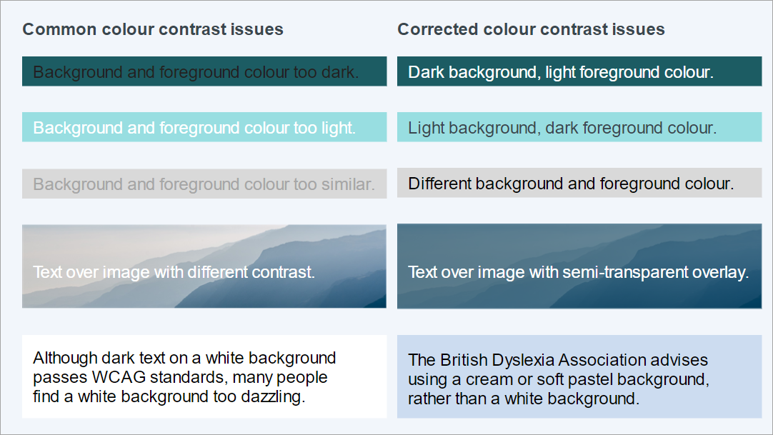
Image shows:
A series of common mistakes with colour contrast often found in eLearning. The first example shows both background and foreground colour too dark. The next shows both background and foreground colour too light. The third example shows the background and foreground colour too similar. The fourth example shows text over an image which has different colours making it difficult to see the light text on the light portion of the image. The correction for this is a coloured semi transparent overlay over the image which makes it possible to see the text clearly everywhere. The final example is black text on a white background which is considered too glaring. The corrected version of this example is black text on a pastel blue background.
How can I test?
Use a colour contrast checker to check the contrast ratio between your text and background colour combinations is at least 4.5:1.
Further information
Useful links
- WebAIM: Colour contrast checker
eLaHub preferred colour contrast checker. - Webfx: Hex to RGB converter
An RGB to Hex converter is useful because your contrast checker may ask for Hex values, while your rapid authoring tool only supplies them as RGB (Red, Green, Blue) values. - UXellence tool: Colorbot
Colour values converter which includes Hex, RGB and HLSA values. - Colorcop: Colour picker
A colour picker can save a lot of time to quickly find out the colour value of a visual element in your resource. - British Dyslexia Association: Style guide
Has recommendations about colour combinations and contrast for dyslexic learners.
WCAG information
| Category | Perceivable |
| Guideline | 1.4 Distinguishable Make it easier for users to see and hear content including separating foreground from background. |
| WCAG link | 1.4.3 Contrast (Minimum) (Level AA) |
| WCAG text | The visual presentation of text and images of text has a contrast ratio of at least 4.5:1, except for the following: • Large Text: Large-scale text and images of large-scale text have a contrast ratio of at least 3:1; • Incidental: Text or images of text that are part of an inactive user interface component, that are pure decoration, that are not visible to anyone, or that are part of a picture that contains significant other visual content, have no contrast requirement. • Logotypes: Text that is part of a logo or brand name has no minimum contrast requirement. |
Copyright © [2020] World Wide Web Consortium, (MIT, ERCIM, Keio, Beihang)
Fully meet 1.4.3 Contrast (Minimum)
We only give a summary of the Level AA standards on our site. Find out how to fully meet this standard in our book Designing Accessible Learning Content.


Recent Comments